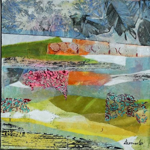
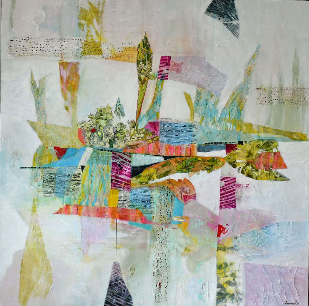
🎨 FAQ — Primary colors in abstract art
🌈 What do primary colors represent in a sensitive and intuitive artistic approach?
Primary colors become a vivid, almost original source. They are the starting point for a universe where transparencies, delicate papers and spontaneous gestures meet to create visual emotions
.🖌️ How can artists enhance primary colors in abstract works?
• By letting the material breathe: tissue papers, collages, light textures.
• By playing on the fluidity of the layers to create light vibrations.
• By modulating saturation to evoke movement, breath, flowering.
🌟 How can I optimize the nuances from the primary colors?
• Mix gently to obtain airy shades.
• Overlay glazes to create depth and transparency.
• Introduce a hint of the third primary color to soften or complicate a shade.
🌬️ How can primary colors evoke nature, flowers, and imaginary landscapes?
The primary colors become chromatic seeds:
• blue opens space, the horizon, the breath,
• yellow brings light, warmth, awakening, • red infuses energy,
pulsation, life
Their dialogue creates interior gardens, waves of greenery, illuminated mountains.
✂️ Do primary colors interact differently with collages and tissue papers?
Yes On fine or translucent papers, primary colors diffuse,
superimposed and metamorphose. They become more vibrant, lighter, sometimes almost floating
.🖼️ How to reinforce the emotional impact of a work using primary colors?
• Using pure primary color as a focal point.
• By creating subtle contrasts between opacity and transparency.
• By allowing colors to meet organically, like spontaneous flowering.
🌱 Are primary colors enough to create a rich and personal palette?
Absolutely. They allow you to compose an infinity of shades, from the softest pastel to the most daring contrasts. Their simplicity paves the way for deeply personal expression.